How to explore the Platform interface
Use the EPOS Platform interface to move from a place on the map to a set of services you can inspect, compare, and share.
The exact service names, labels, and result list may vary between deployments. What stays the same is the overall flow: start from an area of interest, narrow the catalogue, open useful services, compare the available views, and save the result when the workspace becomes useful.
Before you begin
- Open the main EPOS Platform interface for your deployment. For this guide we used the official EPOS Platform.
- This guide uses Santorini as the example area, but the same approach works elsewhere.
- Some services, providers, and datasets may vary between places or time ranges.
Search for an area of interest
When you already know the place you want to study, the place search is usually the quickest way to get oriented. For this example, we will open the place search control in the top-right corner of the map, search for Santorini, and select the matching result in Greece.
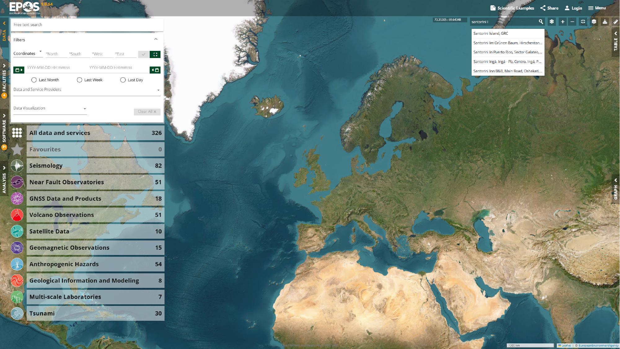
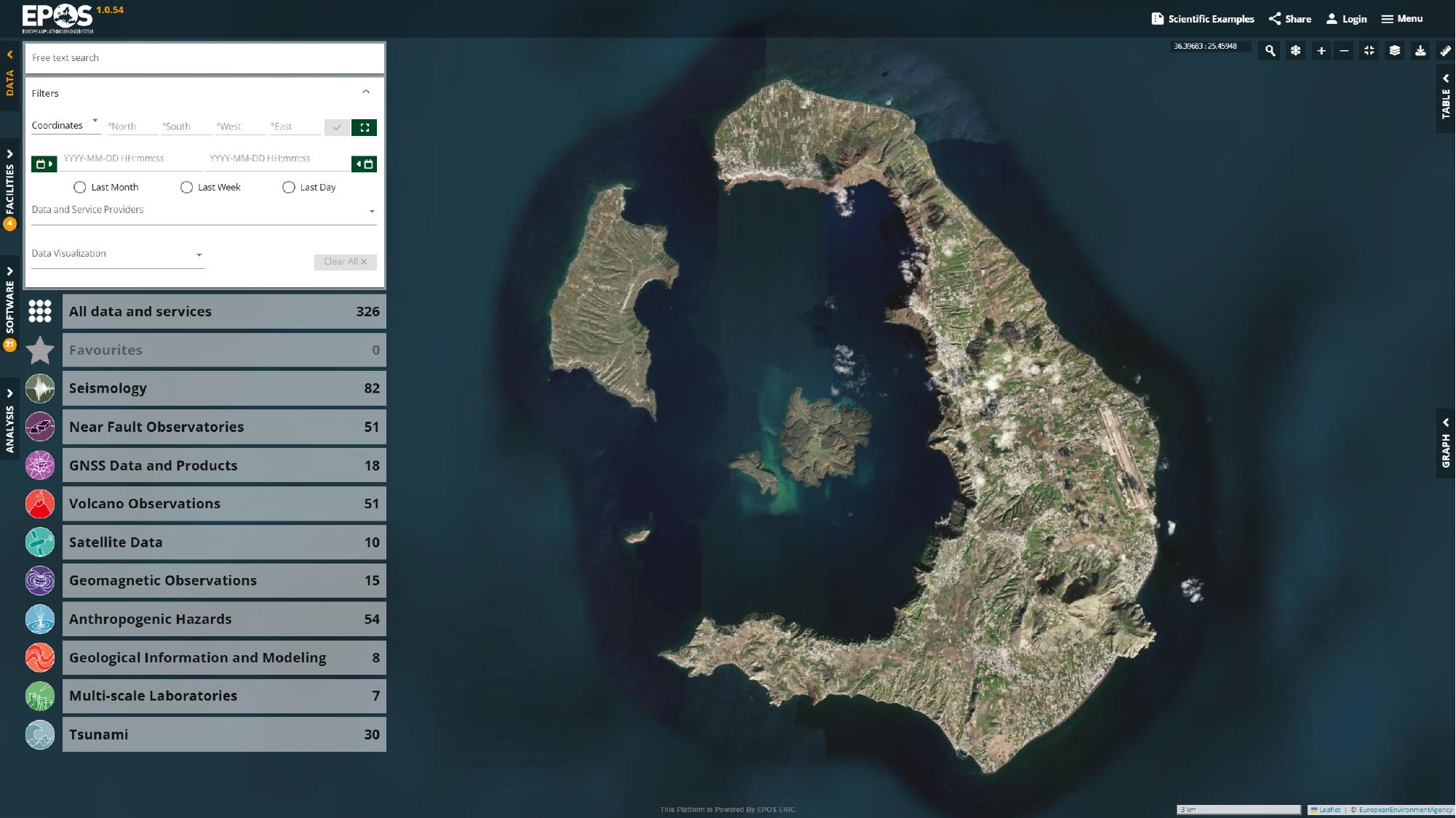
Once the result is selected, the map recenters on Santorini and gives us a concrete working area for the rest of the guide.
Apply a spatial filter
Now that the map is where we want it, we can reduce the catalogue to services that actually cover that area. One of the fastest ways to do that is to activate the rectangular spatial filter in the filter area and draw a box around Santorini.
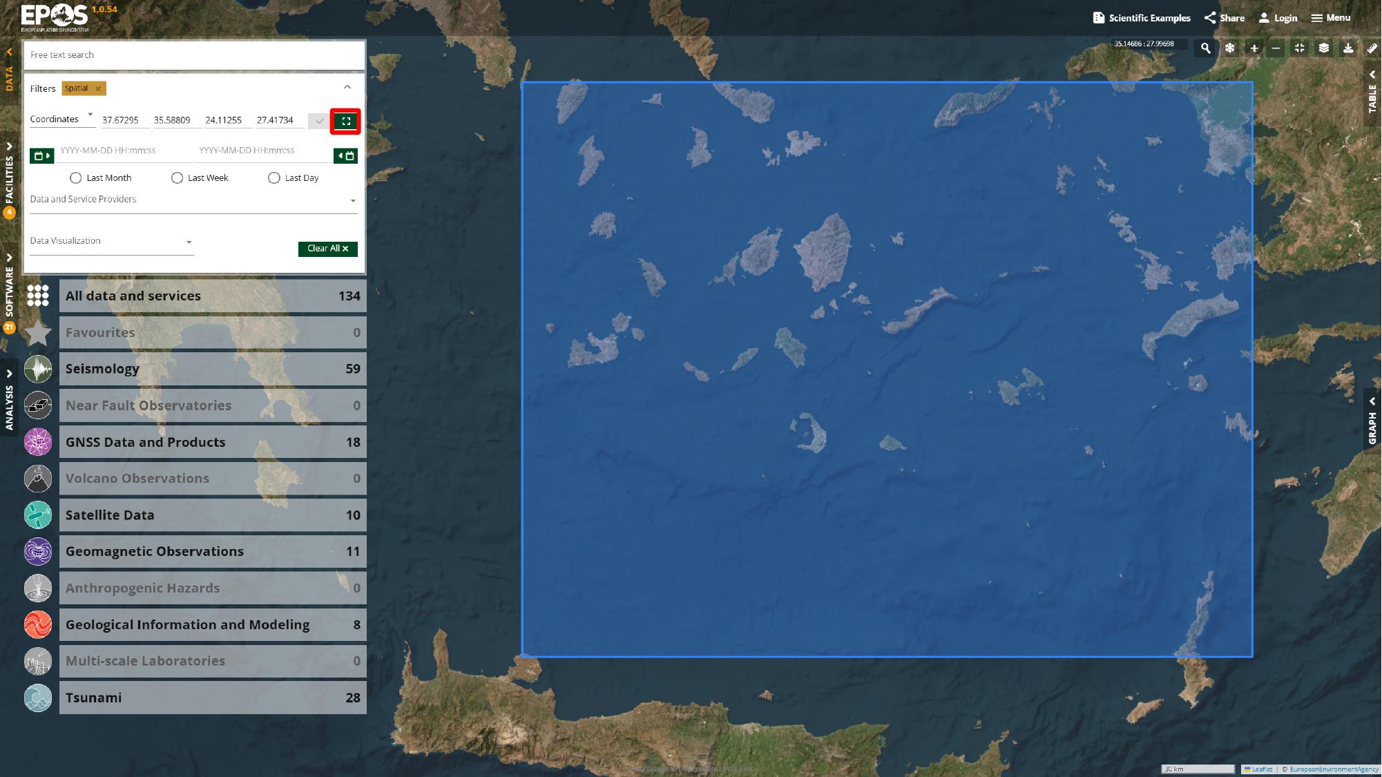
After the filter is applied, the catalogue usually becomes much easier to work with because unrelated services drop out.
Find a relevant service
For this walkthrough, we will start with a moment tensor service for recent earthquakes near Santorini. In the left catalogue panel, use the free-text search box in catalogue mode, search for moment, open Moment tensor data for modern earthquakes (2013-present), and add it to Favorites from the service card.
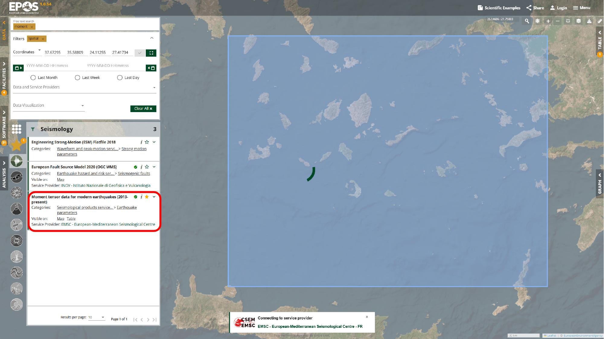
At this point we have a first useful service pinned in the workspace, which gives us something concrete to build on. The same search box can also match service names and descriptions, so later in the guide we will use it again for terms such as geological map and gnss stations.
Favorites are especially helpful here because they let you keep a small, reusable set of services visible while you continue filtering and comparing other results. If you prefer, you can also browse the service list directly and open entries without searching by keyword first.
A service card represents an external data service exposed through the Platform. The Platform helps you discover and work with these services from one interface, but the data always remains provided by the original source.
Configure the service query
Most service cards expose parameters that let you refine the request sent to that specific service. In this case, we will expand the moment tensor card in the left panel, open its advanced filters, set the start of the time window to January 2025, raise the result limit to 300, and then click Apply to send the query to the service.
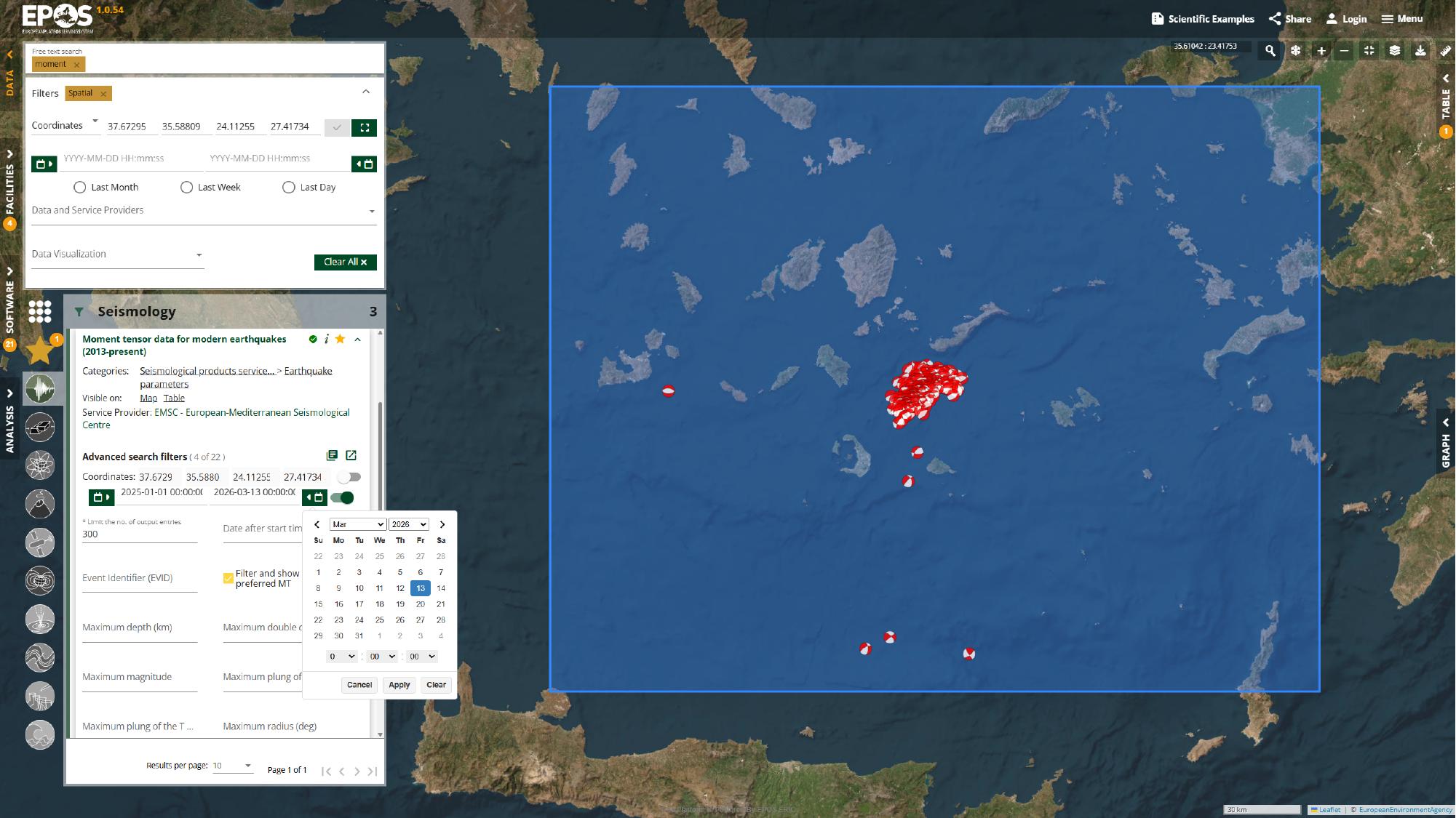
Once the request finishes, the map and any other available views update to reflect the new result set. If that exact date range stops being useful in the future, the same approach still works: use a recent start date, increase the limit if needed, and apply the parameters.
Compare the available views
The same data returned by a service can sometimes be visualized in multiple ways. What makes the Platform useful is not just that these views exist, but that they stay tied to the same underlying data while you move between them.
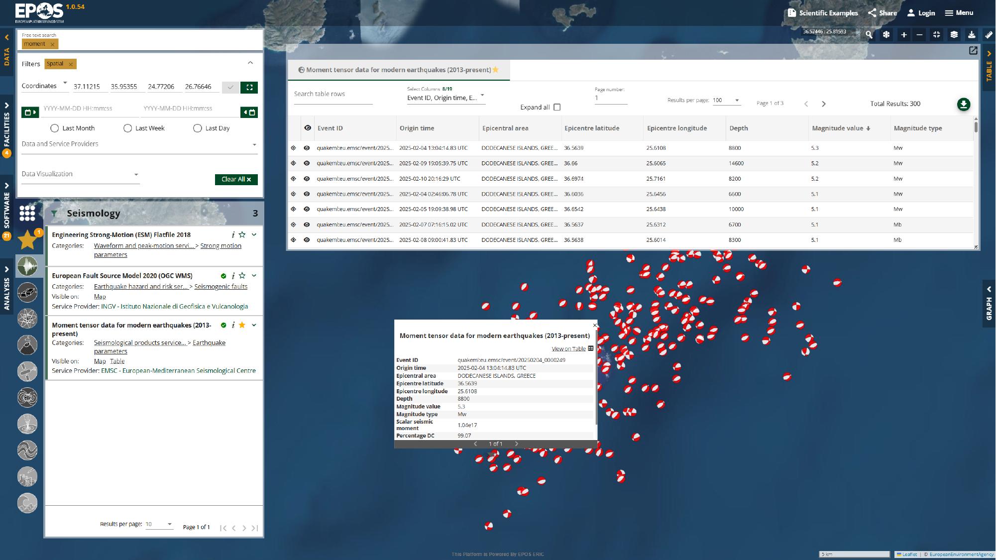
Inspect the map and table views
We can start in the map itself, where zooming, panning, and clicking a focal mechanism symbol (beachball) lets us inspect individual events in their spatial context. From there, opening the Table panel from the right side of the interface gives us the same results in a form we can sort and compare more directly. In this example, sorting by Magnitude value is a simple way to bring the largest events to the top.
Check the service details
The Details view is where the service stops looking like a layer on the map and starts looking like a documented resource. Open it from the same service card in the left panel to review the provider, temporal coverage, license, quality information, linked documentation, and any exposed access links.
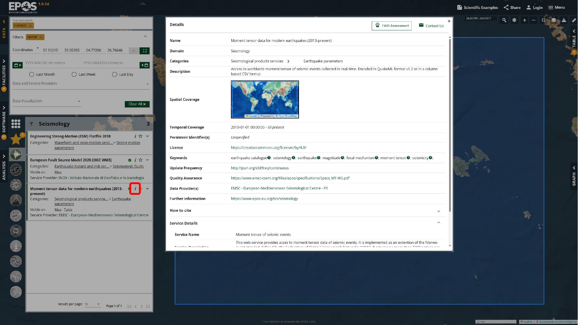
If the service exposes an Access URL or Endpoint URL, this is also the place to jump to the original provider service for more advanced queries or direct interaction with the endpoint. Some services also expose a Graph view; in this guide, that becomes more useful later when we switch from station discovery to GNSS time-series inspection.
Add supporting layers
Once one core service is in place, we can start building context around it. The idea is not just to collect more layers, but to add layers that help explain what we are already seeing.
Add a fault layer
For this example, we will open European Fault Source Model 2020 (OGC WMS) from the service list, add it to Favorites, and then use the layers button in the top-right corner of the map to open the layer panel and its legend.
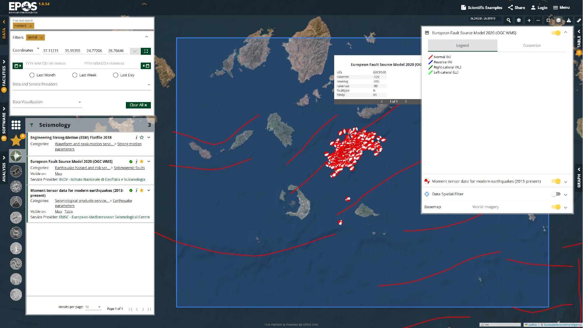
With the fault layer visible, the earthquake cluster is no longer floating in isolation. We can start comparing observed activity with mapped fault structures in the same map view, which is often exactly the kind of cross-check the Platform can be used for.
Add a geological layer
We can push the same idea a bit further with a geological layer. Go back to the catalogue search box in the left panel, search for geological map, open Geological Feature View Service (EGDI Geological Map 1:1,000,000), and then click a geological feature on the map to inspect its attributes.
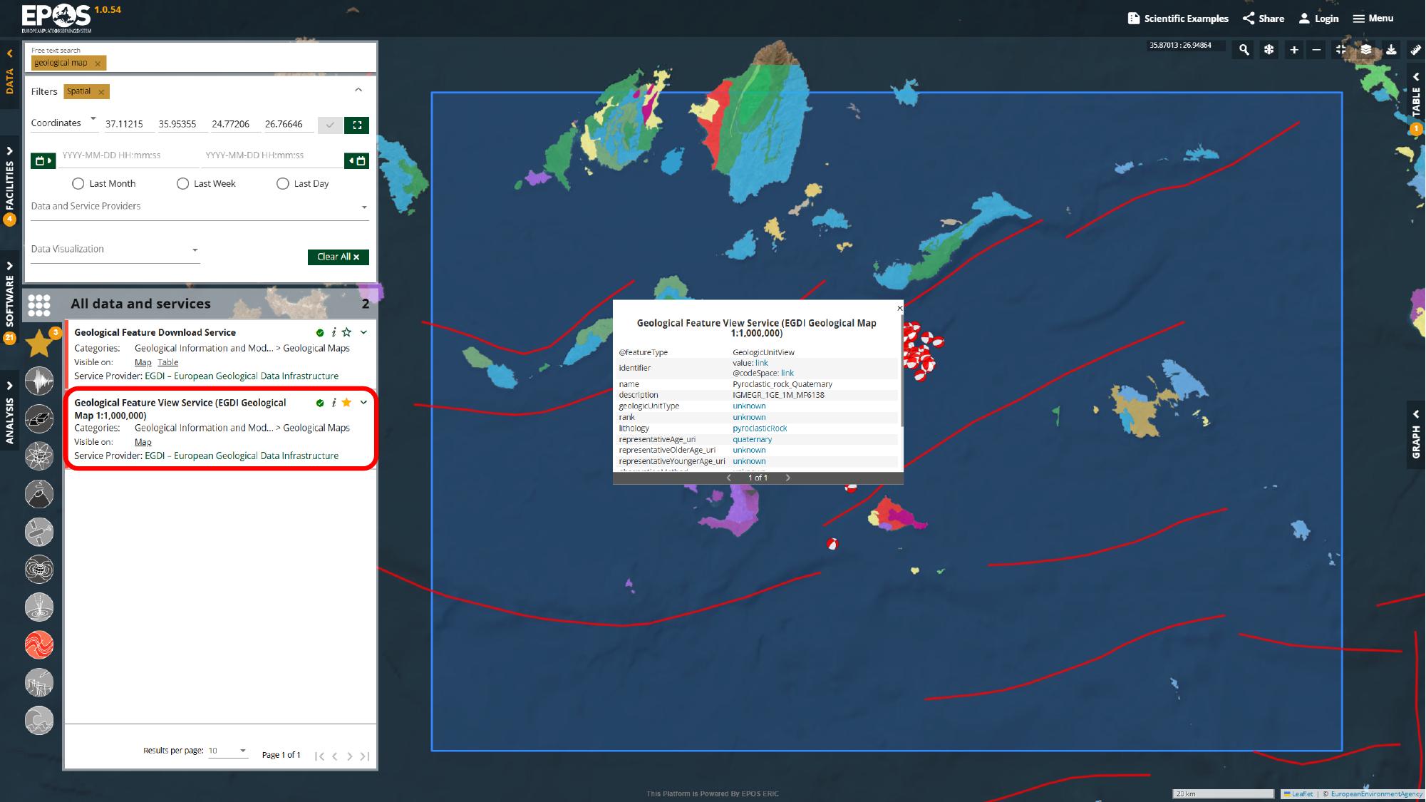
That gives the workspace broader geological context around the same area, so the earthquakes, faults, and mapped geology can all be inspected together instead of in separate tools.
Add a station layer and inspect related data
At this point we have looked at the activity itself and some of its context. The next useful step is to bring monitoring infrastructure into the same workspace.
Add the GNSS station layer
Using the same catalogue search box in the left panel, search for gnss stations, open GNSS Stations with Products, add it to Favorites, and use the layer panel if you want to adjust the symbol style or size.
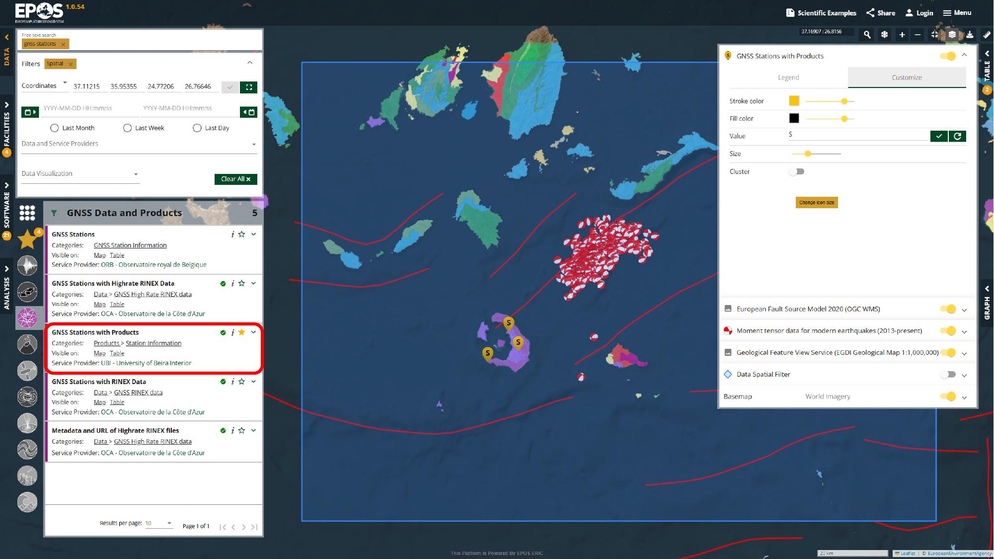
What matters here is not the exact symbol styling, but the relationship between the stations and the earthquake cluster. In this example, the stations sit on nearby islands while the seismic activity is offshore, which immediately raises the question of distance and coverage.
Measure the distance
Because of that separation, it is worth opening the ruler tool from the map controls on the top-right edge of the map and measuring from the station area to the earthquake cluster.
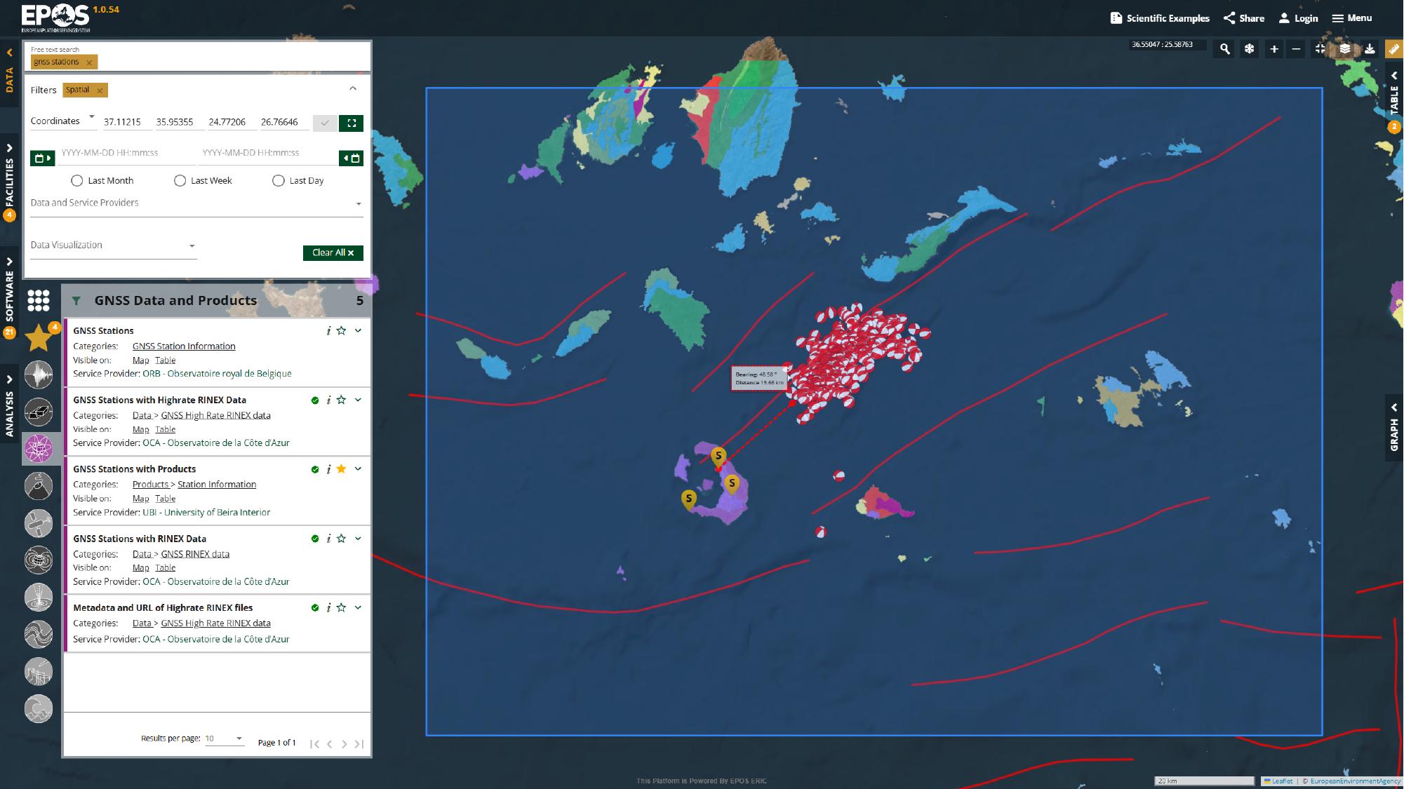
This is a quick check, but it is a useful one. Even a simple measurement helps you judge how close the available station network is to the activity you are inspecting.
Inspect station details
Clicking a station marker opens its metadata and, in this example, also exposes a linked time-series image.
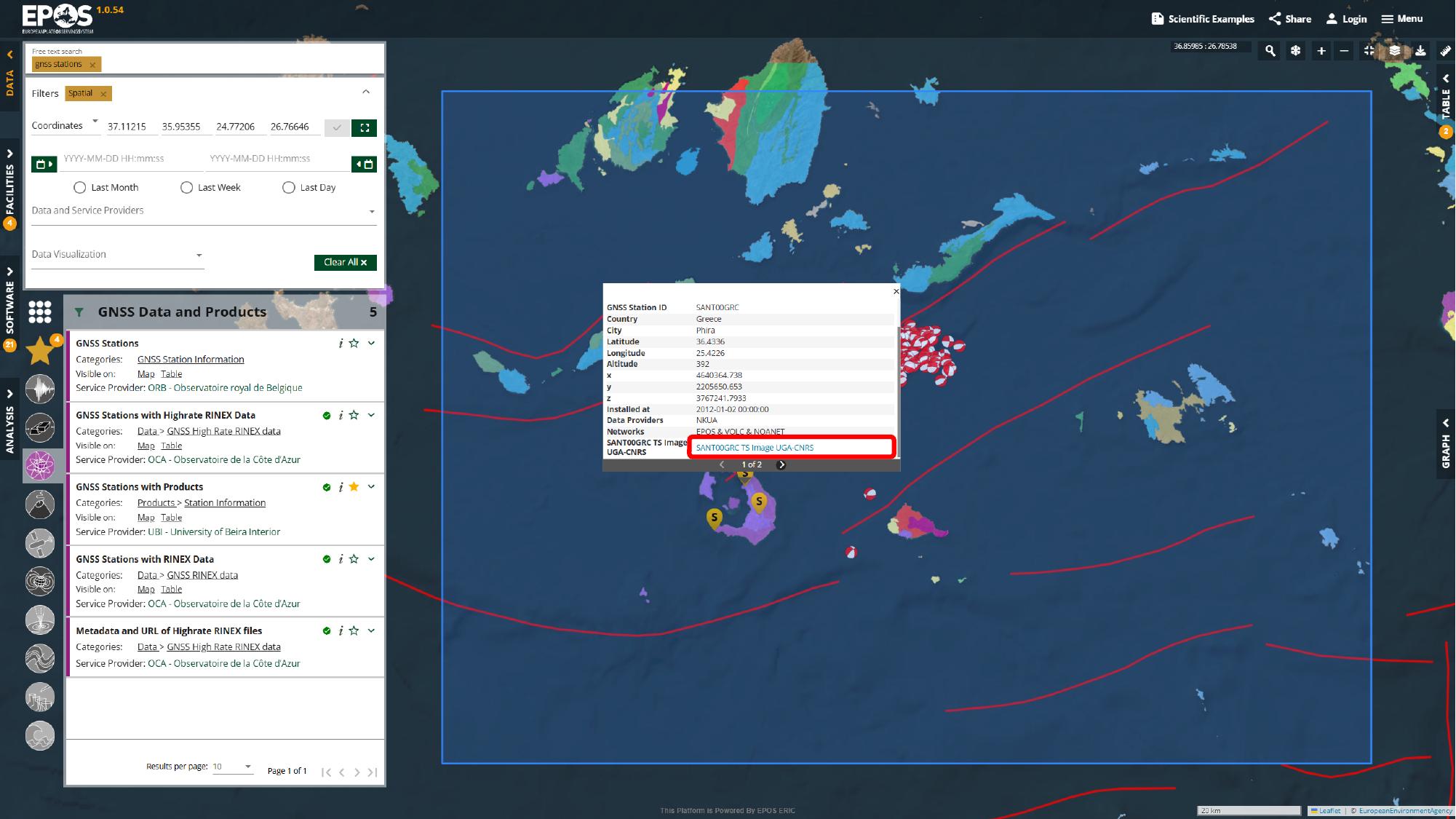
That preview is useful because it gives us a first look at the station output before we move to a dedicated graph-enabled service. Even when a service cannot be rendered fully inside the Platform, the popup may still expose links, previews, or other external resources worth following.
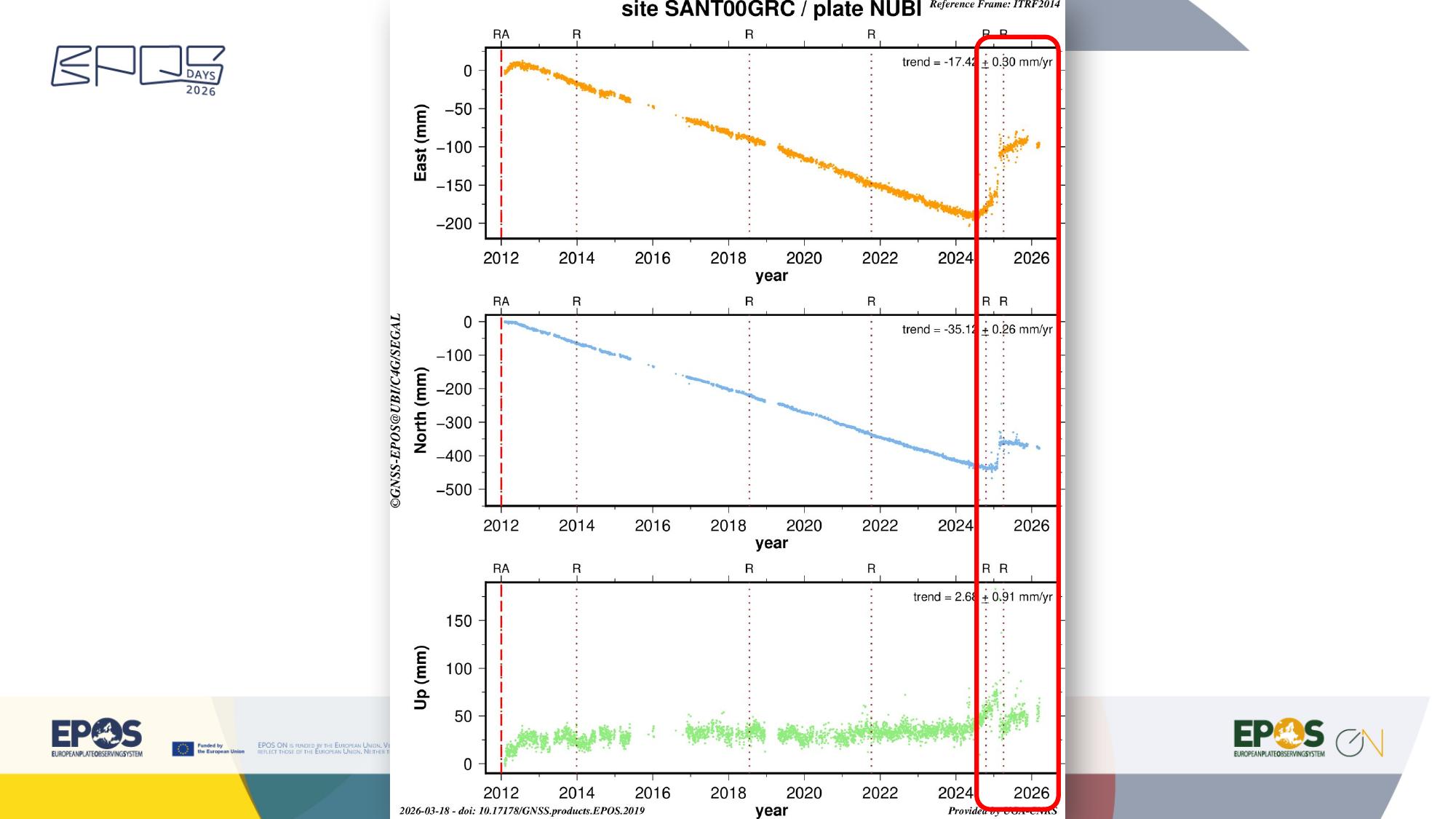
Open a graph-enabled time-series service
In this Santorini example, the station overview layer and the interactive time-series plot come from separate services. That is a common pattern in the Platform: one service helps you discover the station spatially, while another focuses on plotting or analysis.
We can make that second service easier to find by narrowing the provider list first. In the left filter panel, open the data and service provider filter, search for UGA, and apply it.
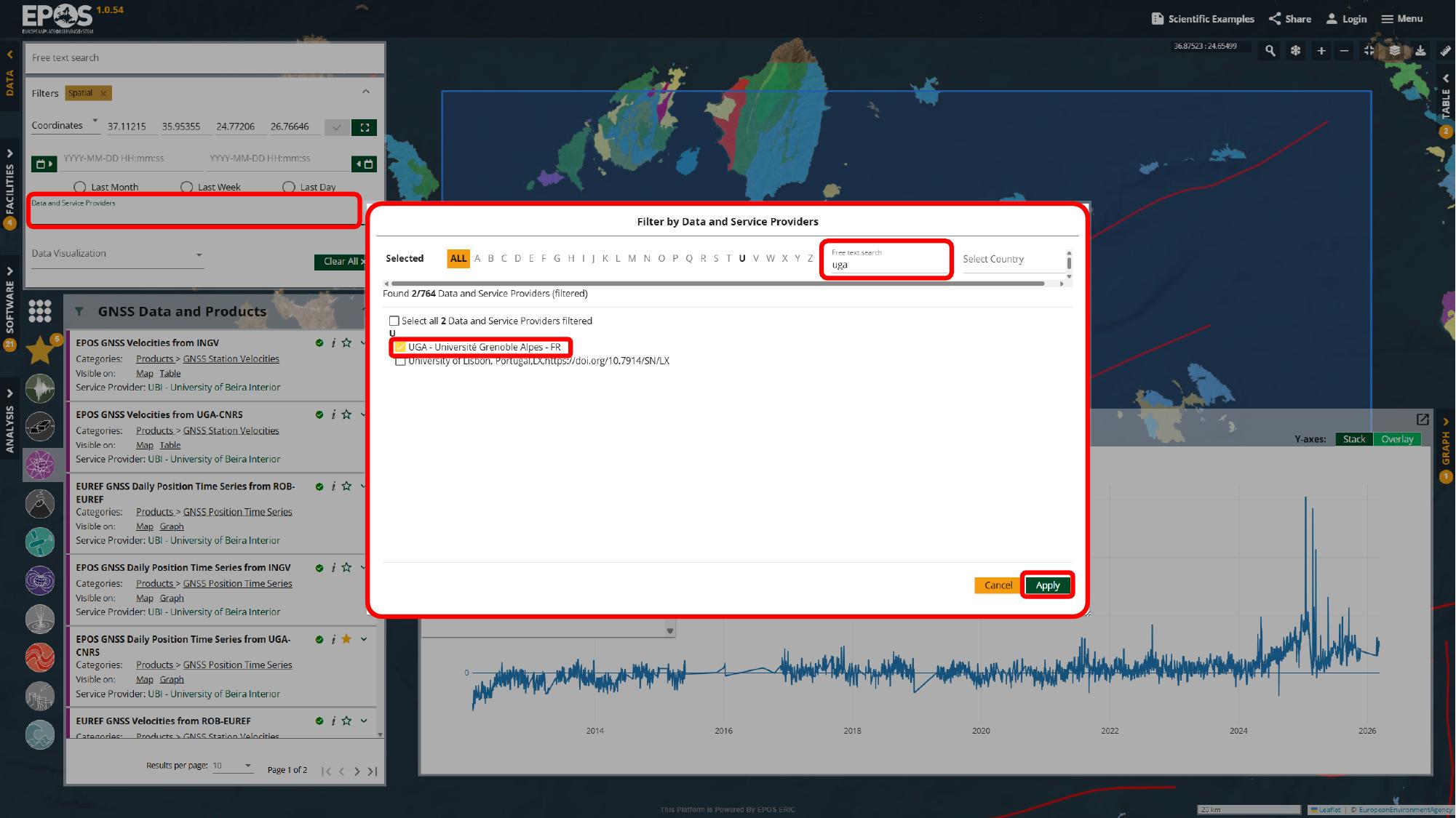
After that, the GNSS time-series entries are much easier to spot. For this example, open EPOS GNSS Daily Position Time Series from UGA-CNRS in the left service panel, enter SANT00GRC in the station identifier field inside the service card, and apply the query there.
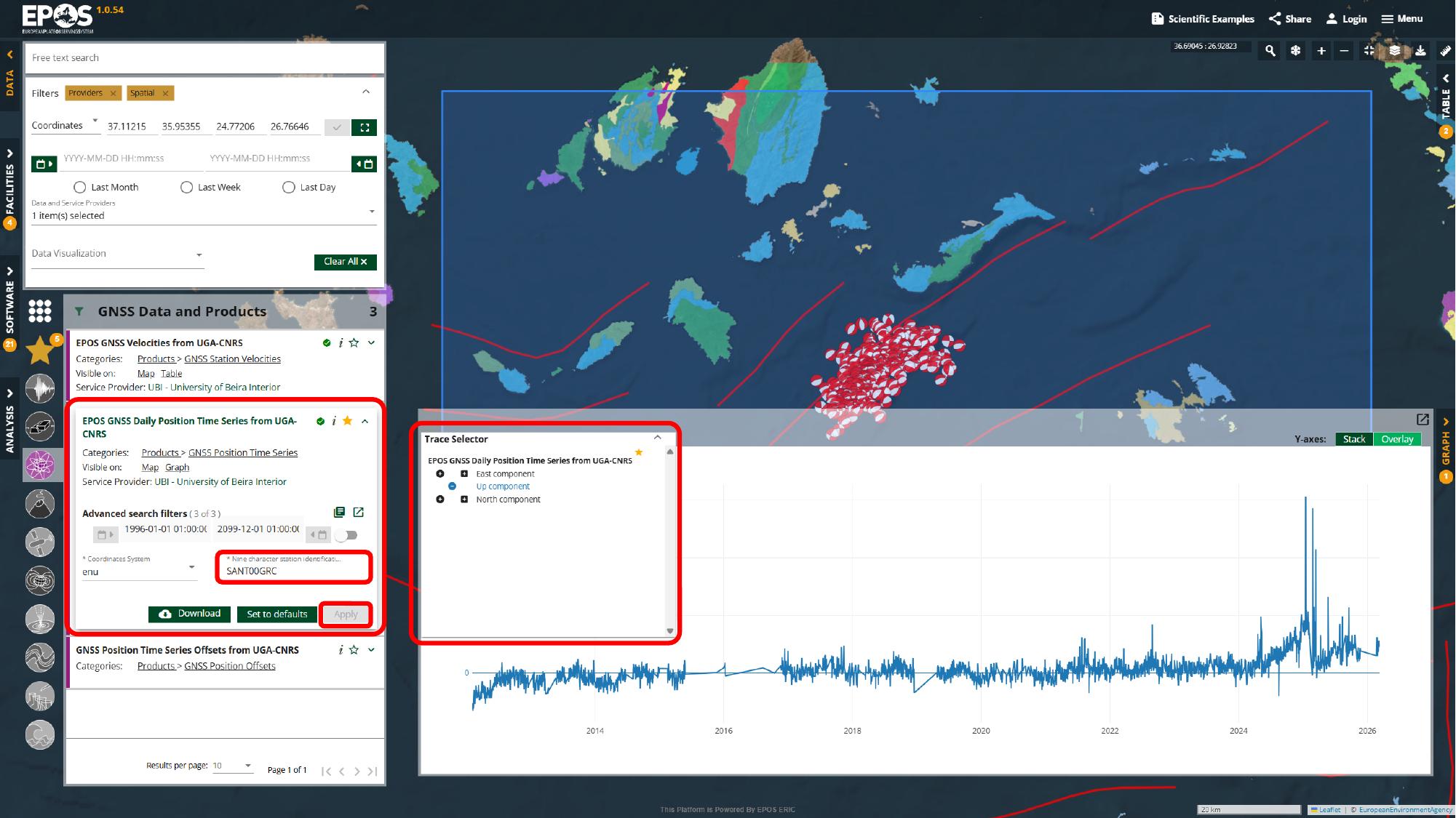
From there, use the trace selector above the graph to add the components you want to compare and expand Graph view from the right side of the interface.
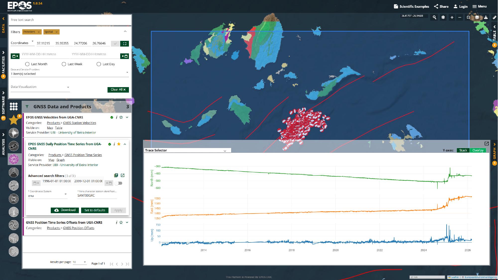
Now we are looking at the same area through yet another lens: not just where the station is, but how its time series behaves over time. This is a good example of how the Platform lets you move from discovery to a more analytical view without leaving the same workspace.
Save and share the workspace
Once the workspace contains the services and filters you care about, it is worth turning that setup into something reusable. Use Share in the top toolbar to generate a link for the current state of the workspace.
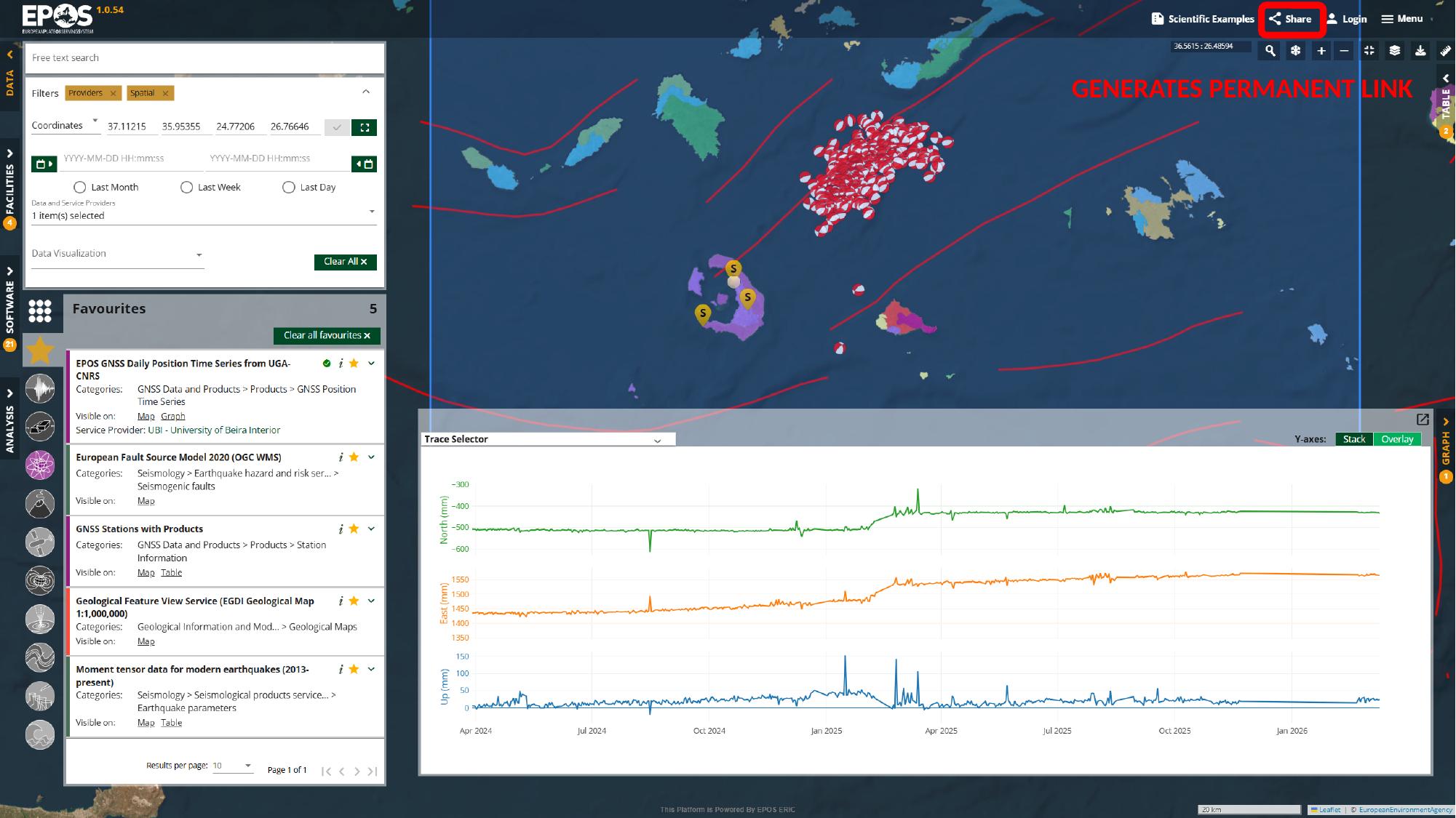
That link can preserve the map extent, selected services, and active filters, which makes it useful when you want to send the setup to a colleague, reopen it later, or use it as a teaching starting point. It is also worth remembering that this is different from the preconfigured examples in Scientific Examples: the share link preserves the state we just built in the current session.
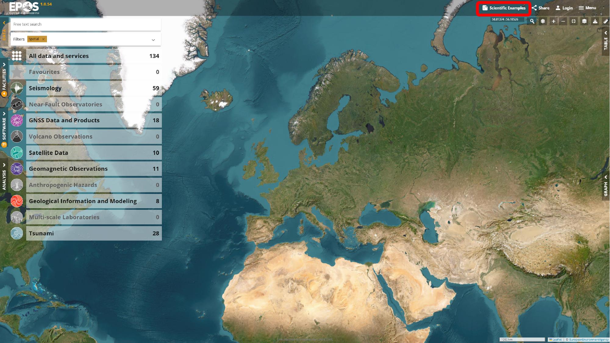
Use Scientific Examples as a prepared starting point
Up to this point, we have built a workspace manually by choosing services, applying filters, and configuring the views ourselves. The Platform also includes a feature based on the same idea: instead of building that curated workspace by hand, we can open one that has already been prepared in the deployment for a specific use case.
That feature appears under Scientific Examples in the top toolbar. Opening it brings up the list of curated examples available in the current deployment.
For this Santorini example, we can select Geodynamic activity near Santorini, Greece from the list on the left, review the description and included services on the right, and then use Load Scientific Example to open it.
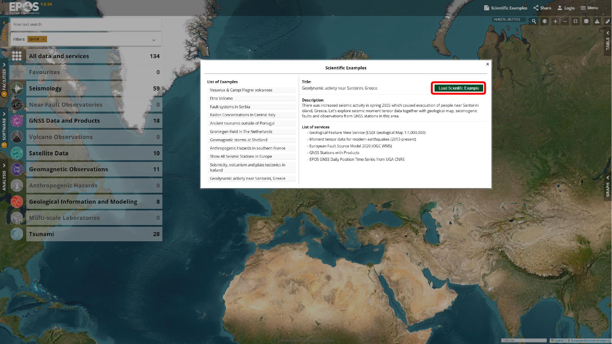
What gets set up is not just the map position. Depending on how the example was prepared, it can bring back a full workspace state with selected services, configured parameters, and active views already arranged for a specific use case.
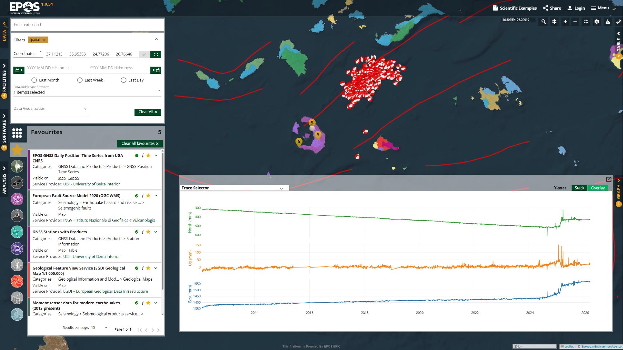
Once the example is open, we can inspect the service details, adjust filters, switch between views, create a fresh share link from the restored state, or continue into notebook-based analysis in a VRE. That is why Scientific Examples is useful for onboarding, teaching, and demos: it gives us a strong prepared starting point, but still leaves the interface fully explorable.
Tip: Reuse the same Favorites in another area
One useful habit is to treat Favorites as a reusable service set rather than something tied to a single place. If you leave those services in Favorites and use the same rectangular spatial filter to draw a new bounding box somewhere else, the Platform can refresh the same service set for the new area.
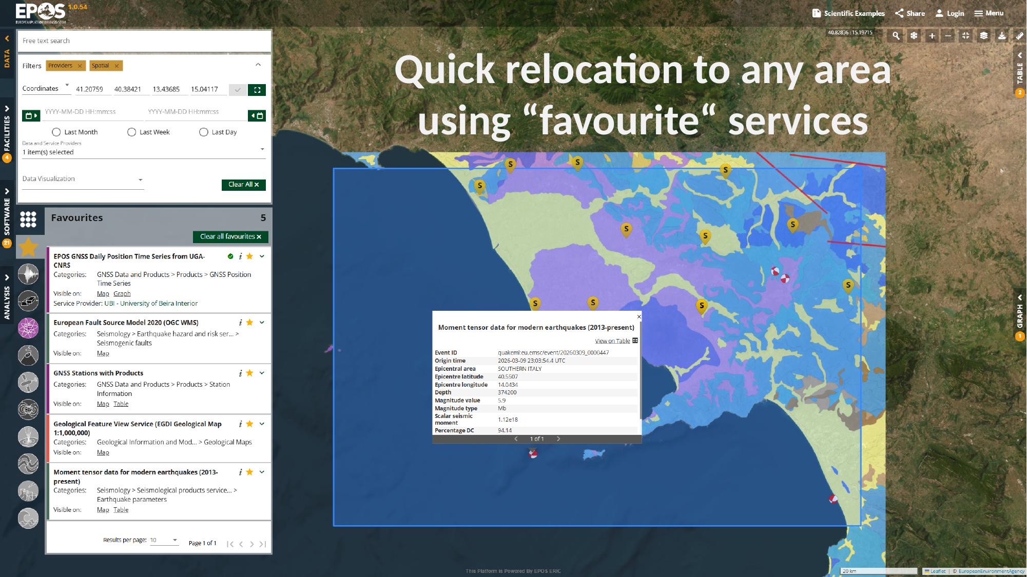
That can save a lot of time when you already know which services help answer a recurring question and you want to try the same approach in a different region.
We have now gone through the main way of exploring the Platform: start from a place, narrow the catalogue, open and configure useful services, compare the available views, and save a workspace worth keeping. Santorini is only the example here; once this flow feels familiar, you can repeat the same approach in other areas and adapt it to other questions you want to explore in the Platform.
Next steps
If you want to take the same exploration further and move from interactive use of the interface into notebook-based analysis, continue with How to use Jupyter Notebooks in the Virtual Research Environment.